01
No consistent identity
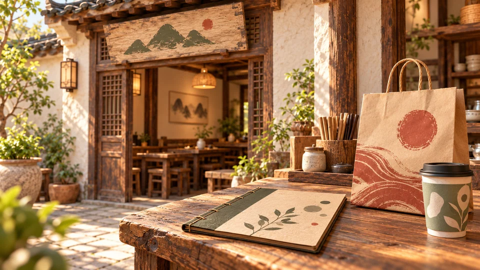
The name is memorable, but the sign, menu, and packaging speak different visual languages.
 WenBei
中文
WenBei
中文

AIGC / BRAND EXPERIENCE / 2026

Wood-fired flavor. A courtyard to gather.
From a courtyard to a host who welcomes you in: A-Chai brings wood-fired food and everyday gatherings into a memorable brand experience.
Brand strategy / Lettering / Color / Character / Touchpoints
01 / PROJECT OVERVIEW
Pichaiyuan is a wood-fired restaurant imagined as a courtyard for friends and family. Good food is the starting point; the familiar welcome, the aroma of the stove, and time together are what bring people back.

02 / THE CHALLENGE
How can a small, lively restaurant build a coherent identity, personality, and reusable brand assets?
01
The name is memorable, but the sign, menu, and packaging speak different visual languages.
02
The courtyard feels welcoming, but the brand has no recognizable host yet.

03
The food and gatherings are worth sharing, but the brand lacks a reusable character and visual language to carry that energy online.

03 / BRAND STRATEGY
Wood-fired cooking and courtyard gatherings form the core, turning honest flavors and warm hospitality into a recognizable brand.

without feeling rough

without feeling dated

without being noisy

without feeling childish

04 / VISUAL IDENTITY
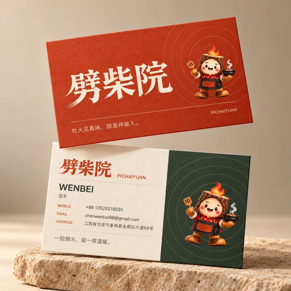
The handwritten wordmark anchors the identity. Sturdy strokes suggest firewood; dry-brush endings echo a passing flame. It feels grounded and human.
The same mark remains consistent across light and dark backgrounds and brand touchpoints.

Wood-fire red: primary color and wordmark
#C84922Ink green: dark backgrounds and body text
#26342BWood: supporting materials and accents
#B86E43Natural paper: light backgrounds
#F5F0E505 / THE CHARACTER
Meet A-Chai.
The courtyard's little host invites guests in, reminds them to eat while the food is hot, and hopes to see them again.
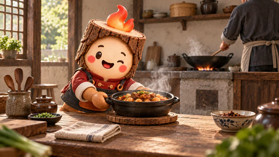
Welcome | Come in, have a seat
Serve | Enjoy this while it's hot
Farewell | Stay a little longer





06 / AIGC WORKFLOW
AI speeds up exploration, while design judgment sets the direction, makes trade-offs, and maintains consistency.
Set three anchors: wood-fired cooking, courtyard gatherings, and warm hospitality.
Test lettering, character proportions, materials, and scenes in parallel.
Reject overly realistic wood grain, excessive effects, and distorted spaces. Keep the flame-shaped hair and rounded face as defining traits.
Use the wordmark, palette, and character traits to align each touchpoint.
Refine details and composition at realistic sizes and in real communication contexts.
Note: This is a brand experience concept. Images and materials are illustrative, not evidence of a launched venue or commercial results.
07 / BRAND EXPERIENCE
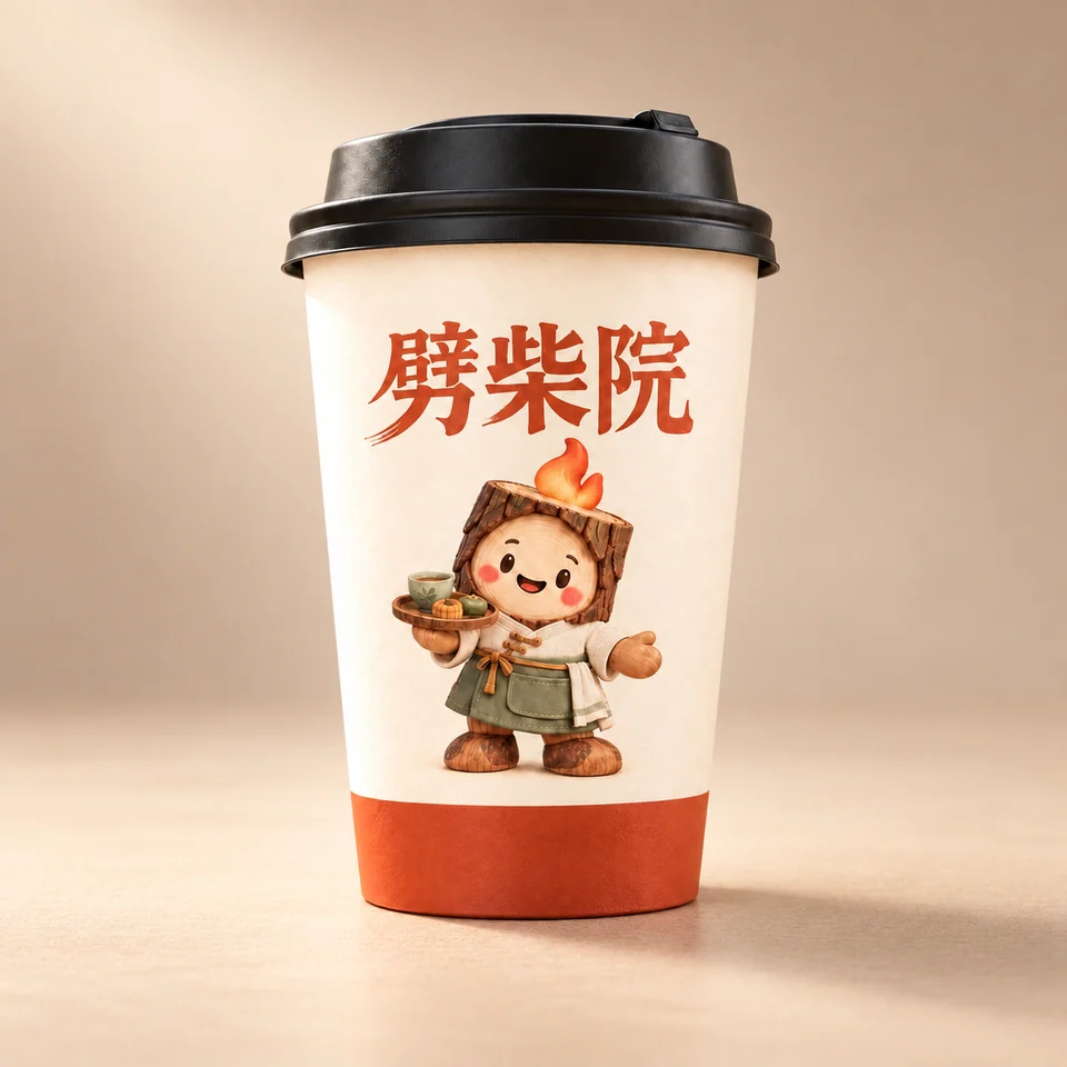
Organize touchpoints around the guest journey so the wordmark, A-Chai, and brand colors remain recognizable at every step.
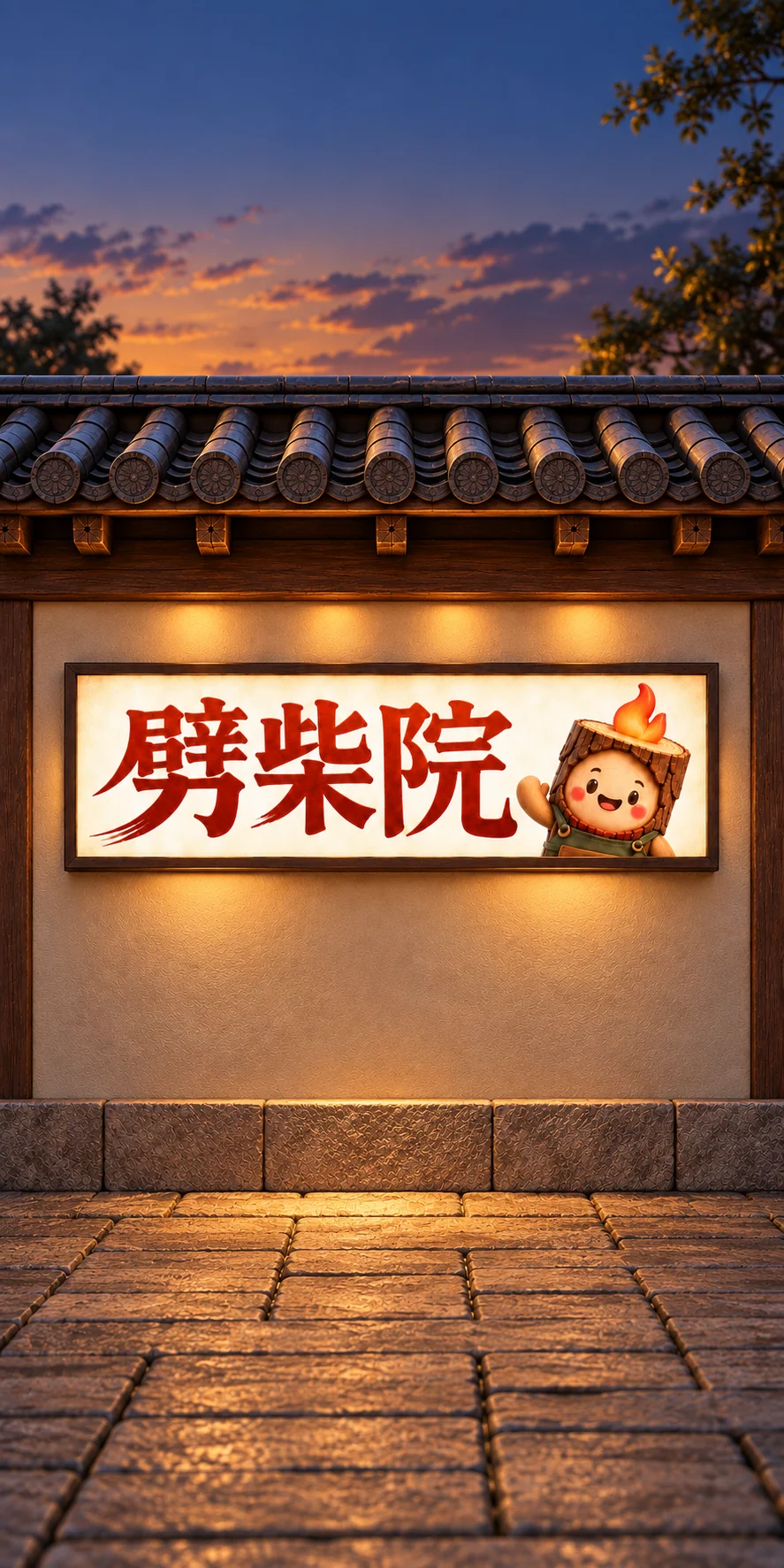
01 ARRIVAL
From the sign to the entrance, A-Chai welcomes guests and introduces the courtyard's character.

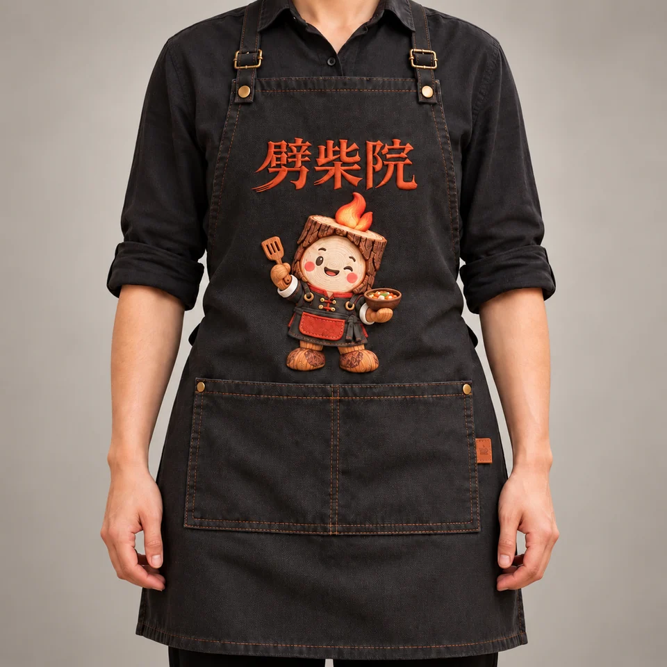
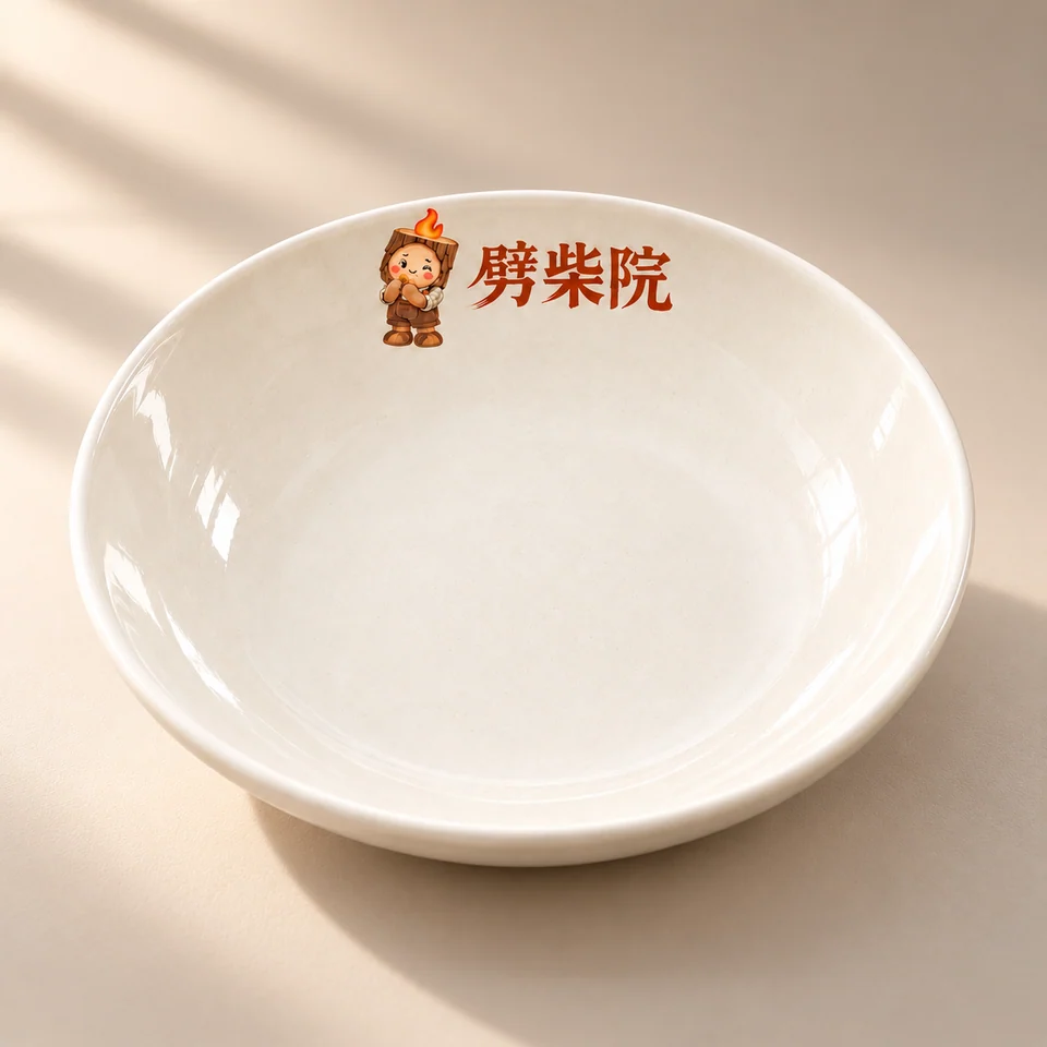
02 DINING
Menus, tableware, and service details support the energy and conversation around the table.


03 TAKE AWAY
Boxes, cups, bags, and A-Chai keepsakes carry the memory of the visit into everyday life.